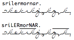
srilermorna
la srilermornar.
The script was originally intended to be written without lifting your pen, however it was found that creating enough permutations of unbroken lines to fill Lojban's 25 letter alphabet became stupidly complex very quickly. Thus began experimentation with simple ways of looping, breaking and bending lines, producing 23 unique letters, which were gradually stripped down to 18 unique symbols, the rest completed with the diacritic flick.
How to read srilermorna
The Flick
Srilermorna has one diacritic mark, the flick. The flick represents vocalisation in the pairs ty./dy., ky./gy., fy./vy. and py./by.. It also marries the pairs ly./ry. and ny./my., where it does not strictly represent vocalisation but simply pairs similar sounds.
Stops
The denpa bu, stop or 'dot' in Lojban has two incarnations in srilermorna, a prefix version and a suffix version. In accordance with its role in spoken Lojban, the stop 'stops' the continuing line of a word. In the case of a prestop, as used in attitudinals and connectives, it begins the line with a small vertical stroke from half height above the baseline, and a poststop, used in cmene, is the same but downwards from the baseline, to half-height below, ending the line.
In addition to these, another, very specific stop is used in transcribing proper names, the comma. The srilermorna comma looks like this:
Stress Notation
Irregular stress, indicated in the latin system with capital letters, is notated in srilermorna by a straight, horizontal bar which sits above the irregular syllable.
How to write srilermorna
Srilermorna letters tend form more cleanly when the pen is moving quite quickly.
When writing on lined refill, the recommended method is to use two lanes per line of text, using the blue line in the centre as the baseline.
Spacing:
Although not vital to the legibility of a text, accurate spacing is a surprisingly big part of srilermorna's overall aesthetic. Cramped letters become cluttered and messy, although not necessarily unreadable. All letters should be roughly evenly spaced, including spaces. The writer might imagine a grid in which one box fits a single letter.
Calligraphy:
As evidenced in the computerised lettering above, the script is takes its style from calligraphic strokes using a broad tipped pen. A paintbrush or brush-tipped felt pen also works well, and calligraphic writing recreates the aesthetic effect intended by the script. This form is suited to presentation of poetry, art or other artistic media.
About letter breaking:
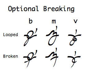
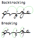
Optionally, the writer can 'break' a marked, looped consonant in order to write the diacritic flick without having to backtrack over their finished word. The letters cy., jy., zy., ry. gy. and dy. already involve lifting the pen from the paper so do not present an issue. It is the writer's discretion whether he or she prefers breaking or backtracking in their writing.
How to type srilermorna
Get the font
Layout
Typed srilermorna spaces itself, and lends itself equally well to center or left-side alignment, but due to the strict regular spacing, should not be justified lest the lines break.
Keyboard mapping
The script is implemented as a truetype font over the latin character set. Therefore it should be totally cross-platform and map directly to any western keyboard configuration. It does not have any special input method, save for the following features:
- Prestop and poststop: these are both typed with the period (.) key and should configure themselves while typing. a period will default to a prestop unless folowed by a space, where it will automatically convert.
- Forcing poststops: A period can be forced to a poststop in the absence of a space by following it with a grave (`). This is sometimes necessary at the end of a line or inside cmene strings.
- Forcing a break for by, vy and my: To type the broken version of by, vy or my, follow it with grave (`).
- Note: Using the ` grave symbol to force poststops and type broken letters does not remove the presence of the grave symbol in the text, it is merely invisible. This allows simple ascii copy-pastes to render correctly. For example:
- .y'y maps to both the ' key and the h key.
- Characters which aren't covered by the font (like numerals, brackets etc) usually default to some latin font, depending on the system. Exceptions to this are Q, q, W, w and grave, all of which have the same symbol, a blank space with no width, so they render as invisible.
- Stress bars map to capital letters, making traditional stress notation compatible.


