Talk:lojbo sinxa: Difference between revisions
m (Gleki moved page Talk:Lojban Logo to Talk:lojbo sinxa) |
No edit summary |
||
| Line 24: | Line 24: | ||
*[[File:Borromean Rings Illusion.png|200px]] | *[[File:Borromean Rings Illusion.png|200px]] | ||
*:Borromean rings were also proposed as Lojban logo. | *:Borromean rings were also proposed as Lojban logo. | ||
== lo 3mei cimde sinxa pe fi'e la [[User:pier.abat|.pier.abat.]] == | |||
<gallery widths=180px>> | |||
File:logo.jpg | |||
</gallery> | |||
lo krasi: [[:logo.pov]] and [[:File:logobig.ppm|logobig.ppm]] | |||
==lo drata se cuxna se stidi pe fi'e la'o gy.Jeff Tupper.gy.== | |||
<gallery widths=200px>> | |||
File:simplerlojbanflag.gif | |||
File:lojbanflags.gif | |||
File:lojbanflags2.gif | |||
</gallery> | |||
== lo za'u lojbo lanci pe fi'e la [[User:Broca|.arj]] == | |||
These flags were drawn by arj as a reaction to the sentiment that the Lojban logo looks "thin" or "unsubstantial". | |||
<gallery widths=180px>> | |||
File:FLAG1.GIF | |||
File:FLAG2.GIF | |||
File:FLAG4.GIF | |||
</gallery> | |||
==Archived discussion== | ==Archived discussion== | ||
Revision as of 08:37, 24 April 2014
The Lojban Logo (which appears at the top left of Wiki pages.) Available also from la tsali's webpage: http://arj.nvg.org/lojban/jbosinxa.html
Discussion
The logo resulted from a competition announced in JL 13 (August 1990). The competition results were announced in JL 14 (March 1991): the winning design was Guy Garnett's. From JL 14: Template:Talkquote
The Necker Cube[1][2] was the "2nd place logo", an alternative proposal by Jamie Bechtel, and many people (at least Nick) wish it had won the vote instead. The "two logos" principle[3] seems to have been forgotten in the three years between the vote and doing anything about it; the Necker Cube might thus be legitimately resuscitated. Of course, the use of the Venn-diagram logo on The Book means it must needs remain the primary logo.
The logo represents both the LLG and Lojban. From JL 14: Template:Talkquote
- I suspect the logo has not been so used; does anyone know?
- Let me get this straight: both the symbols being spatially-perceptual ambiguities, they are appropriate for a logically-unambiguous language how?
- It's not. It's an appropriate symbol for the Anti-Lojban.
- nitcion:
- They are intended to illustrate how mind-blowing the Sapir-Whorf effects are, I think. At least, the Necker Cube is. But Paul Dounda expressed the same criticism in JL13.
- I agree about the Necker cube, but I always thought of this one as being just weird. I don't understand it at all. How is it ambiguous? What does it mean, besides just 'lojban'?
- The intersecting circles can be seen as ends of a cylinder two ways.
- nitcion:
- Guessing: Venn Diagram = Logic; Axes = ... Algebra? Cultural neutrality, via the four points of the compass? Sapir-Whorfesquery, as in "your mind can go anywhere, thanks to Lojban?"
- Jay:
- Someone who recognized the Lojban logo as being the Lojban logo, but didn't know what the parts were supposed to mean, asked "the two blue circles represent hemispheres of the earth and the arrows indicate the universality of Lojban?" about the best interpretation I've heard of it yet.
- .mark.:
- On a lighter note, I suppose you folks should see the Animated Lojban Logos I made a while ago, for fun (on another page because animated GIFs are Evil and should be placed someplace special.)
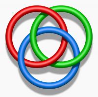
- Borromean rings were also proposed as Lojban logo.

lo 3mei cimde sinxa pe fi'e la .pier.abat.

lo krasi: logo.pov and logobig.ppm
lo drata se cuxna se stidi pe fi'e la'o gy.Jeff Tupper.gy.


lo za'u lojbo lanci pe fi'e la .arj
These flags were drawn by arj as a reaction to the sentiment that the Lojban logo looks "thin" or "unsubstantial".


Archived discussion
- http://balance.wiw.org/~jkominek/lojban/9203/msg00067.html
- http://balance.wiw.org/~jkominek/lojban/9411/msg00138.html
- http://groups.yahoo.com/group/lojban/message/1450
- http://groups.yahoo.com/group/lojban/message/1456
- http://groups.yahoo.com/group/lojban/message/1461